Some may not see the critical role of fonts in a professional or business document, but it is actually quite important. When you think about it if someone hands you a contract that’s typed in a comic sans font, would you take that contract seriously? Or if it was using some vintage art deco font with bold embellishments and all, is that something that would make you think that the document weights some importance? The silent impact of fonts can be long-lasting, so yes, it is important to make sure you have the right professional fonts to use when the need arises.
Luckily, finding professional fonts isn’t that hard at all, in fact, you can easily find them on readily available software like Microsoft Word, Canva, Google Docs, and the like. To make things easier for you, we went ahead and compiled a list of professional fonts that you can find on these platforms to help you curate that clean, sleek professional look on your documents. Continue reading below to see our list!
What Makes a Font Professional Looking?
Before we start on our list, let’s tackle some points on how to determine if the font looks professional.
Legibility
First and foremost the text of your document should be more important than the font, and if the font will get in the way of the text, that’s definitely a big no-no! Legibility is one very important detail that you need to consider when choosing a font.
Try out the font first in a random paragraph and see if you can read it properly and if it is pleasing to the eyes. If you’re able to understand and read the whole paragraph with ease and without any complaints, then chances are the font is readable.
Size
This goes hand in hand with legibility. Some fonts may appear smaller and some may appear wider and larger in size. remember, you don’t want your font to look too small and narrow, as it can compromise its readability. And if you end up choosing a wide and large font, it might not look as professional and clean. Choose a font that has a good neutral size. Usually, great font size is something that can look great on both bigger text sizes for headings and smaller text sizes for body texts.
Font Type
Here we go into font types. There are a lot of font types out there, but if you’re after the professional font aesthetic, just stick to two font types, the Serif and the Sans Serif. Serif fonts have a more traditional aesthetic because of the presence of the serif, an ornamental line that is placed on the beginning and end of a letter’s stem. While Sans Serif fonts don’t have those lines which give it a more minimal, clean overall look.
Interestingly, some people say that serif fonts are more apt for printed material as it appears to be more legible in that medium, and that sans serif fonts are a better fit for digital use or screens. Whichever font you choose, it’s important to remember that it fits your overall professional aesthetic and also fits the purpose of your document or texts.
Professional Fonts on Word
Microsoft Word is really an all-time favorite of the public, mainly because of its accessibility and ease of use. The software already houses a ton of pre-installed fonts you can choose from and they have quite a number of professional fonts that you might like. Check out our top font choices for Professional Fonts in word.
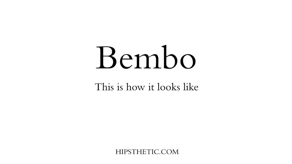
Bembo font
If you’re leaning towards a serif font choice, the Bembo font is right up your alley. The typeface gives that roman serif font looks that we are widely familiar with today so it won’t be something negatively eye-catching to use.
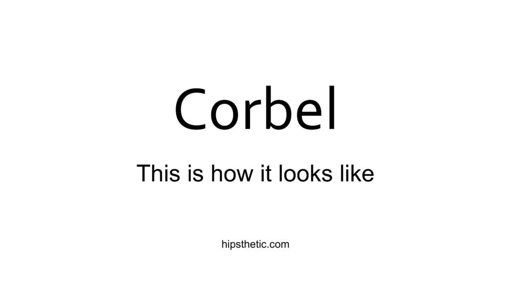
Corbel font
Eying something sans serif that has great legibility? Then you can put the corbel font on your list. This professional font on word gives that clean, crisp appearance on both screen and paper. Best of all it’s functional in all sizes!
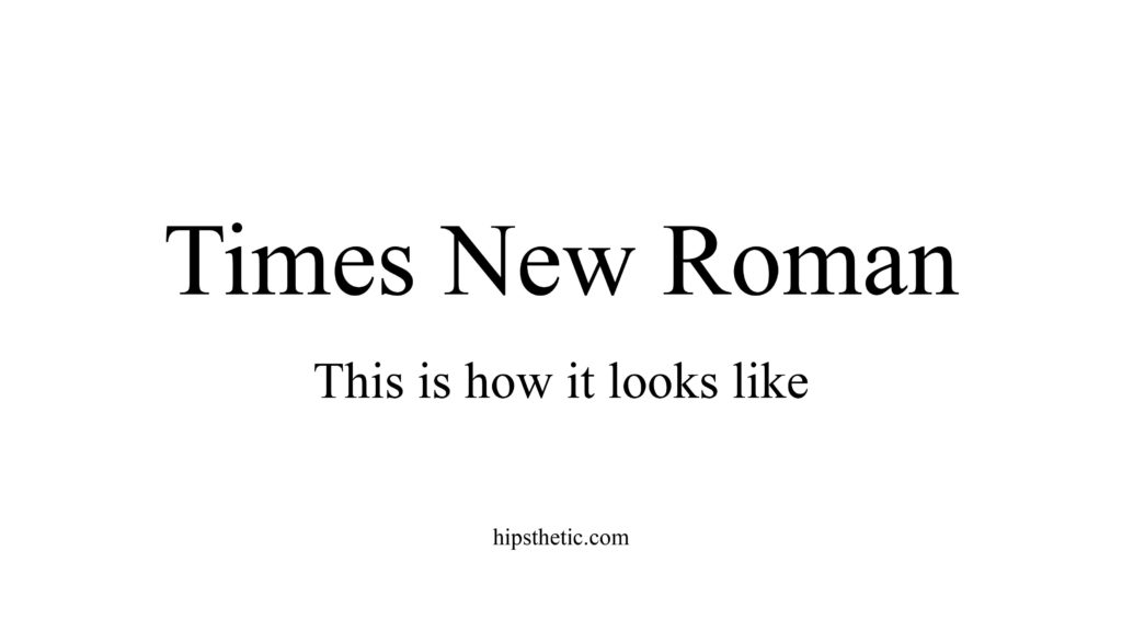
Times New Roman font
Of course, this font won’t be off our list! The Times New Roman font is simply a classic. It’s popular for a reason, and that it’s always dependable. You can surely use this on any formal text, just use this on both legal and non-legal documents then you’re good to go!
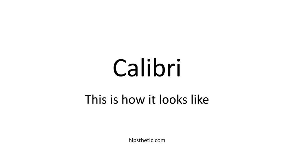
Calibri font
Another one of those classic professional fonts on word that’s familiar to everyone. The Calibri font brings out that modern sans serif look from its round corners and nicely spaced characters. Definitely suitable for both on-screen documents and printed texts.
Professional Fonts on Google Docs
We all know that Google Docs is a wonder! It’s really really accessible, easy to use, and great for collaborative documents especially if you’re writing a group paper for school or some important collaborative work document. They also house some great system fonts that you can try and choose from.
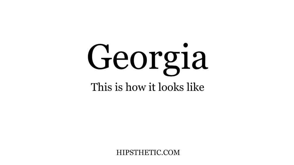
Georgia font
An interesting thing about the Georgia typeface is that it was designed to be legible and readable on any font size. Whether it’s big or small, the font will be readable and pleasing to the eyes.
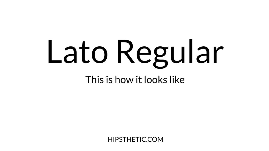
Lato font
This semi-rounded sans serif font was designed by designer Łukasz Dziedzic during the summer of 2010. Interestingly, the name “Lato” means summer in polish. This sans serif font gives that clean elegant look that you can surely use on a professional document.
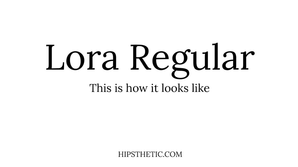
Lora
Want to add a bit of fun but still professional detail on your texts? You can try this Lora font! Its well-balanced serif characters show a bit of a resemblance to calligraphy with its contrast and slightly brushed curves. A great choice for something cheerful but subdued.
Professional Fonts in Canva
Canva is one impeccable design resource platform that’s all the rave nowadays. It’s highly friendly and easy to use for everyone. The platform houses a ton of different templates, stickers, and of course, fonts! From handwriting fonts to 80’s style fonts they’ve got it all. Let’s take a look at some of the best professional fonts in canva that you might want to use on your business-related designs and presentations.
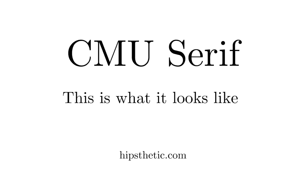
CMU Serif Font
This professional font in canva was designed by Donald Kunth. It features a modern clean serif font look, that’s pleasing to the eyes and appropriate to use on formal and professional documents.
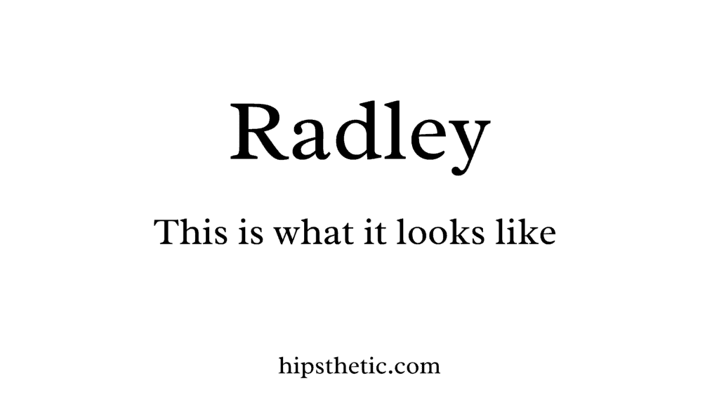
Radley
This interesting font was actually for woodcarved tilting work. It’s actually based on letters used by hand carvers to cut letters efficiently but with aesthetic. These characteristics make it very easy to read and still keeps that put-together look that you want in your business and professional documents.
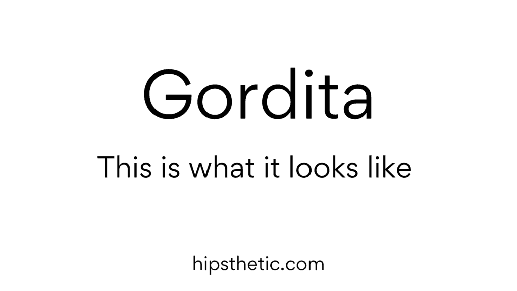
Gordita
This one is a great professional font in Canva that showcases its geometric roots. The Gordita font is a sans serif typeface with simple yet elegant modern details that captures that amicable yet systemized look.
We hope you enjoy our blog on professional fonts. If you want to learn more about fonts that you can appropriately use for work or school, you can check out blogs on Best Professional Fonts in Word, and Best Fonts to Use for a Resume.