Despite the emergence of minimalist, casual, or art deco modern fonts, Typewriter fonts bring great nostalgia. It is a significant element and detail to add if you’re looking for that classic vintage touch on your texts.
What Makes a Font a Classic Typewriter Font?
Finding Typewriter Fonts on Word seems difficult to some, but the software gives a few options in their pre-installed font list. Have you ever thought about what exactly does it have to take for a font to be called a Typewriter Font? Let’s dive a bit deeper.
One main characteristic of a Typewriter font is its spacing. Typewriter fonts are usually fixed pitch or can also be called mono-spacing. This means that each character, whether an “O” or an “I,” takes the same space. This differs from modern or digital texts wherein texts are proportionally spaced. Proportional spacing gives the right amount of space on each letter/character to make it look most legible. Some fonts that may appear to look like typewriter fonts can be classified as “slab serif” fonts. Others may even contend that typewriter fonts are the perfect fonts for writing!
Typewriter Fonts on Word
In this list, we included fonts that have mono spacing or fixed pitch, and that has that “typewriter” font look.
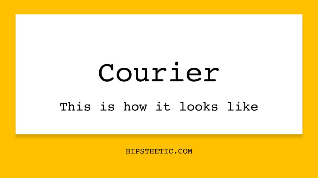
Courier Font Family
This font family comes to mind immediately when talking about typewriter fonts on Word. The Courier Font Family was actually purposely designed as a typewriter font for IBM. It contains all the “typewriter font characteristics” that you can possibly look for – a slab serif look with that monospace design.
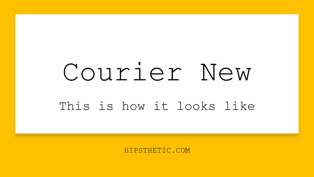
Courier New
Courier New is a reworked version of the Courier Font featuring higher line spaces, heavier punctuations, and significantly thinner and lighter weight.
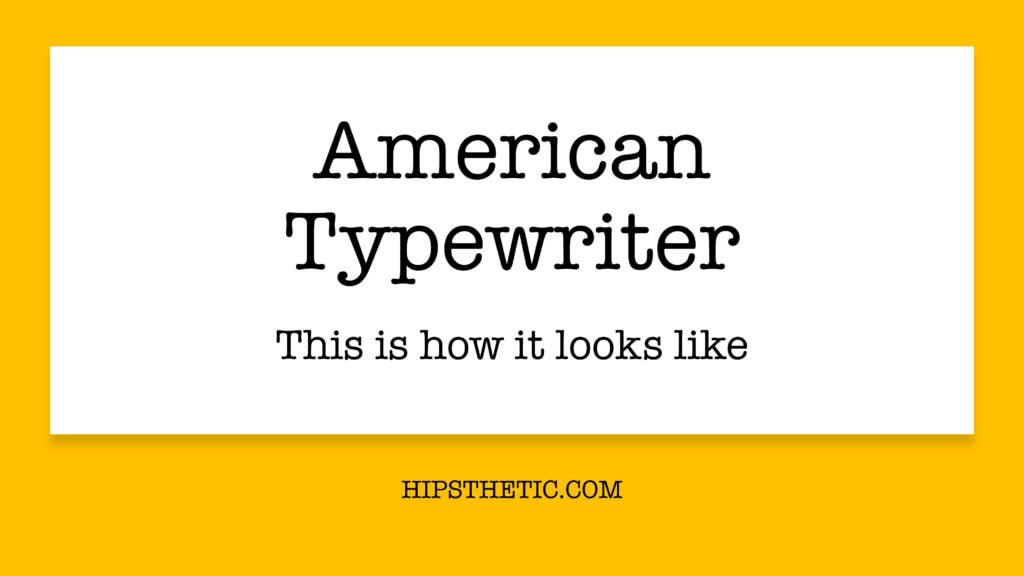
American Typewriter
The American Typewriter font is based on the slab serif design of a typewriter font. However, it doesn’t have a fixed pitch and uses proportional spacing. Nevertheless, if you’re going for that typewriter font aesthetic, you can consider this a good font choice.
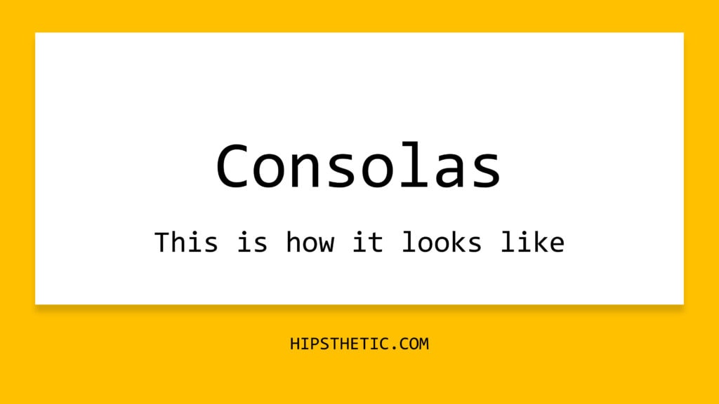
Consolas Font Family
The Consolas Font Family is one example of a font without the slab serif design but has the fixed pitch characteristic of a typewriter font. This font family features all of its characters and letters to have the same width. Its clean and minimal appearance makes it a good option for both personal and business use.
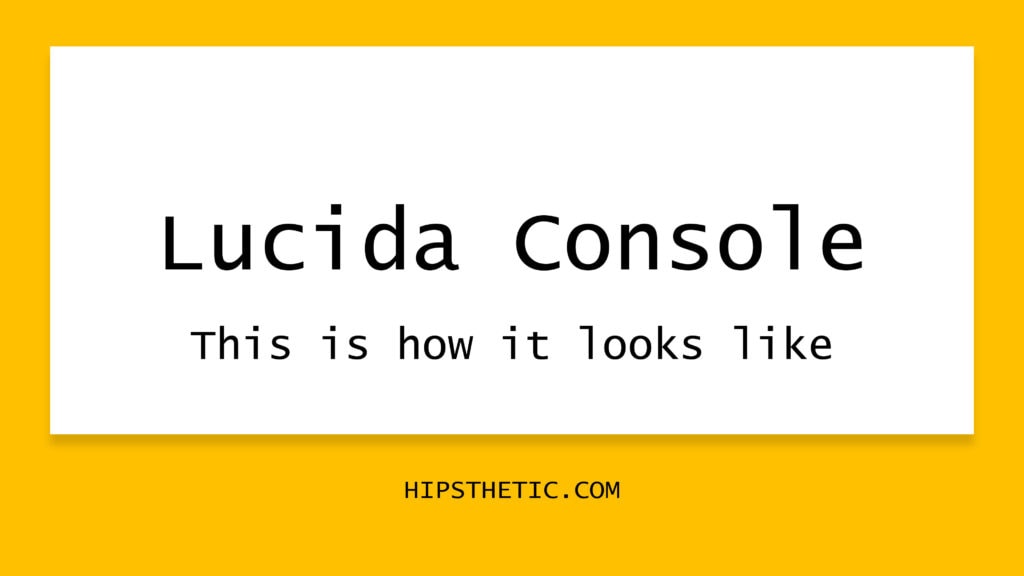
Lucida Console
The Lucida Console font actually stemmed from the Lucida Sans Typewriter fonts back in 1986. This monospaced font was initially intended for functional use in business-related documents and the like. One of the Lucida Console’s prominent features is its short capital letters. This feature was actually a technical modification to fit the old operating system’s limitations. Eventually though, its short capital letters earned its charm, and the Lucida Console font has been a crowd favorite.
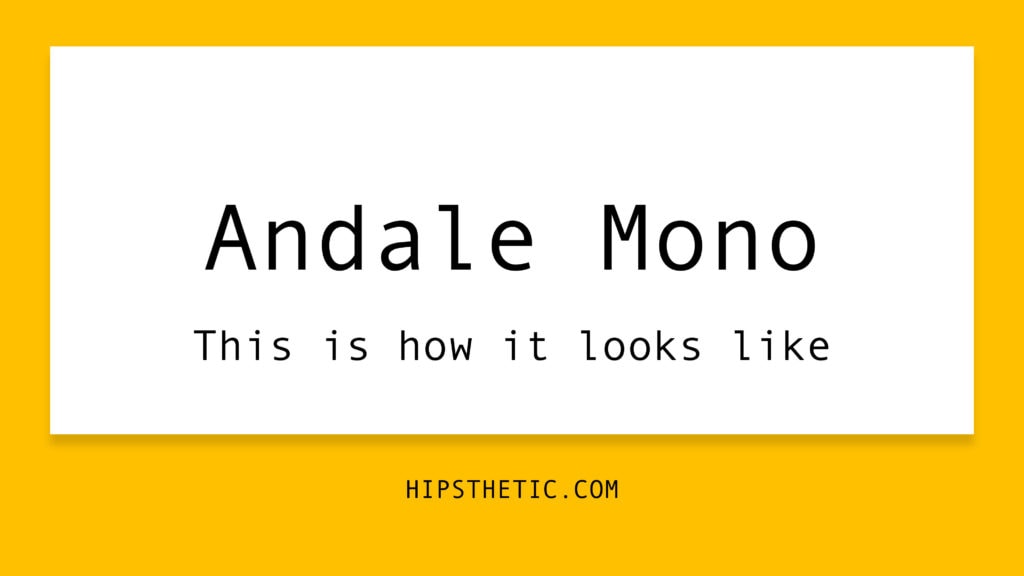
Andale Mono Font Family
An interesting thing about the Andale Mono Font Family is that it was also called “Monotype.com” as a particular version of the font for an Internet Explorer add-ons page. Eventually, they decided to revert back to its original name, which is “Andale”. The Andale Mono font is simply a monospaced font designed to be legible and easy to use.
Typewriter Fonts to Download
If you’re not satisfied with the initial selection of typewriter fonts that you can find on Word, you can always opt to expand your font list by downloading fonts on the web. We listed a few Typewriter inspired fonts that might tickle your fancy. Of course, this list houses free fonts! Check them out below!
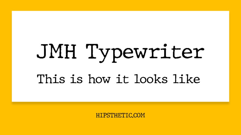
JMH Typewriter by Jorge Morón
This font offers that traditional typewriter font aesthetic, with its slab serif design and uneven lines on its characters for that fresh ink effect. It features different weights from regular, to thin, to bold and black and is built for personal use. To download this font click here.
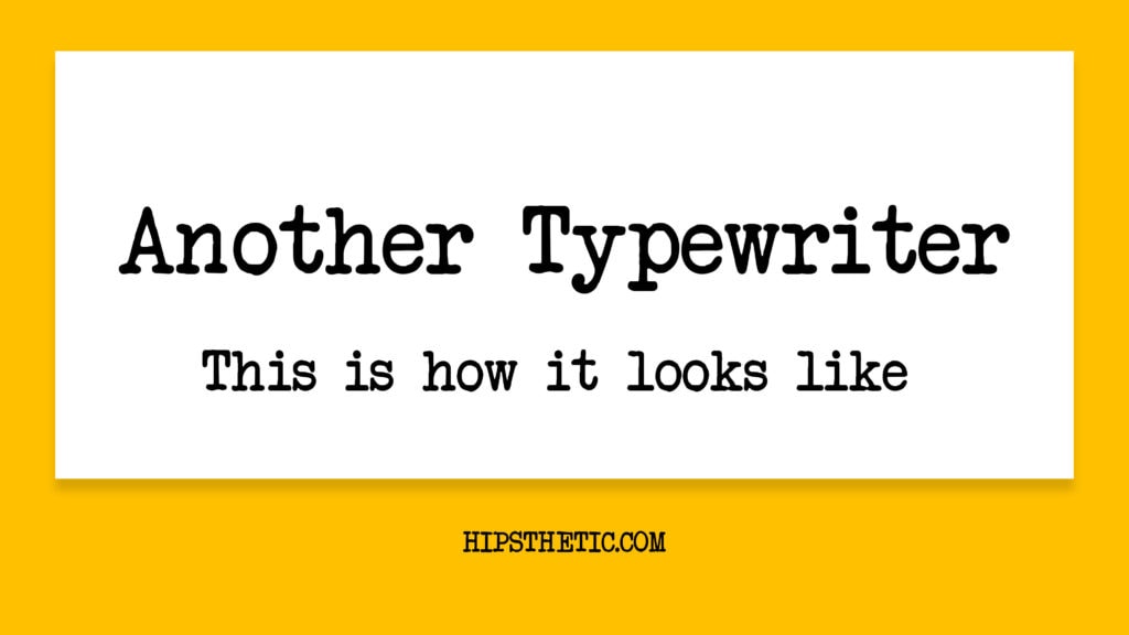
Another Typewriter Johan Holmdahl
This typewriter aesthetic font features shorter and condensed characters in the slab serif style. A great font to use for personal projects that feature that typewriter aesthetic. Get this font here.
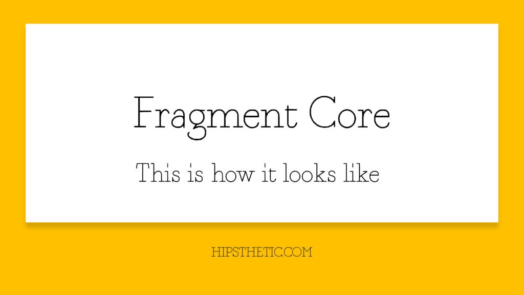
Fragment Core by sugargliderz
This font features a typewriter aesthetic in a round, and thin weight. It’s highly complimented with its slab serif design and makes it easy to the eyes and is perfect for projects seeking that typewriter aesthetic with a modern twist. To download this font for free, click here!
More Free Fonts
We hope you enjoyed our list of the Best Typewriter Fonts on Word. For more free typewriter fonts check out our posts on Which Fonts Look Like a Typewriter, and Typewriter Fonts Copy & Paste.
If you’re interested in knowing more about the fonts that you can utilize on the Microsoft Word platform, we also have a list of the Best Cursive fonts on Word, Professional Fonts in Word, and Handwriting Fonts on Word. To learn how to download fonts on Word step by step on different devices check out our How to add fonts in Word post!