We’ve catalogued the five most important and commonly used 80’s and 90’s style Vaporwave fonts.
As an audiovisual movement Vaporwave has very definite impressionist leanings. It’s proponents pair iconography of 80’s and 90’s culture with Muzak tropes – soft pastel gradients, anime screenshots and 3D renderings adorn albums characterised by pitched-down crooning, mid-tempo percussion and Smooth Jazz riffs. At it’s most affecting, as with our 20 best Vaporwave album covers of 2015, the pairing occupies a bizarre emotional headspace, unique to the genre.
Accurately mimicking UI tropes that we associate with an embryonic information age reinforces the façade that Vaporwave works to construct and there are fonts that are inextricably associated with that era, which is why we’ve compiled of the five most essential Vaporwave fonts.
If you find this list helpful, you might also want to check out the free pixel, 80s and glitch fonts that we’ve catalogued.
Alien Encounters
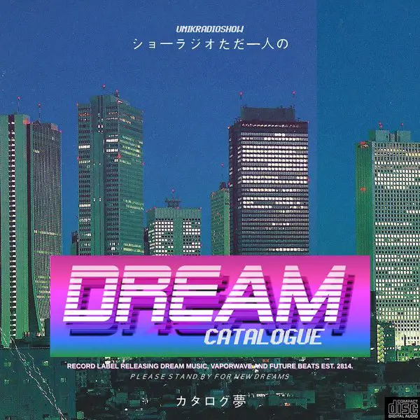
This is the font used by London-based Dream Catalogue, the Vaporwave record label behind 2015’s 新しい日の誕生 by 2814 – a cross-over success that made the leap from Bandcamp’s underground into the mainstream music press. Visually, their catalog is bathed in a Blue and Purple wash typically associated with 80’s Sci-Fi. In this spirit their logo, which utilises the aptly named ‘Alien Encounters’ typeface, invokes the forward leaning, horizontally sliced fonts of Blade Runner and Tron.
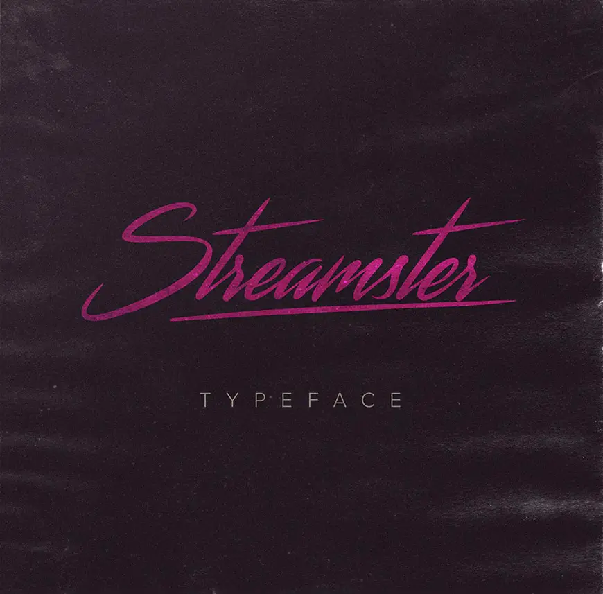
Streamster
Streamster is an awesome, 80s-style script font generously made available for free to Hipsthetic by Youssef Habchi. With it’s maximalist, retro leanings, it’s a font that is perfectly suited to Vaporwave-based web or print projects, where it could be used – combined with vintage textures, 80s iconography and neon-lit colour palettes – to offset blocky serif fonts and create posters, album covers or realistic looking badges and logos.
VCR OSD Mono
Pixel art is a mainstay of Vaporwave art, it evokes a child-like nostalgia associated with 8-bit consoles and runs with the movements Japanese leanings. Fittingly, VCR OSD Mono’s glitch-y, pixelated form plays on video game culture and compliments the warbled, pitched down vocals of Vaporwave that often mimic malfunctioning VHS tapes as does our list of the 8+ Best Free Glitch Fonts.
Times New Roman
Microsoft has distributed Times New Roman with every copy of Windows since version 3.1, the operating system released in 1992. Not only was it intrinsic to an embryonic information age, it was also an appropriation of a once excessively grandiose culture. And just as busts of emperors and white marble columns adorn Vaporwave album covers, Times New Roman has become a staple of Vaporwave – it’s a font that reminds us of our shared relationship techology and plays on the genres accelerationist tendencies.
Itc Fenice Regular Oblique
Also known as ‘the Seinfeld font’, the instantly recognisable ‘Itc Fenice Regular Oblique’ is an iconic Serif typeface. It was a staple of the sitcom that ran from 1989-1998, gracing every one of the shows title cards from Season 3 onwards. And as such, it has an inextricable link with 90’s culture and is forever lodged in the collective subconscious of an entire generation.
Broadway
If Seinfeld is ‘the 90’s show’, Miami Vice is undoubtedly ‘the 80’s show’. It’s parpy synth soundtrack, neon kissed Pink, Blue & Teal colour palette and maximalist swagger epitomise an era of accelerated consumerism and high life extravagance. Broadway was the font that faced the show and as such has been adopted by Vaporwave as shorthand for the decade.