In the world of written communication, the font you choose is just as important as the words you use. Fonts can help you communicate your message and influence how your readers perceive your content. This is why, choosing an easy-to-the-eye font is extremely crucial! In this list, we will discuss which fonts are easiest to read whether in print or digital platforms. Most of these fonts are readily available in different software, so you wouldn’t have to worry about where to get them.
Benefits of Using Fonts that are Easiest to Read
One of the first benefits of using fonts that are easiest to read is that it quickly unlocks the main purpose of your printed or digital writings – for your reader to quickly and easily understand your message. This is especially true for printed materials, where the reader may not have the ability to adjust the font size or color as they can on a digital screen. If the font is difficult to read, the reader is likely to become frustrated and move on, missing out on the intended message.
The second benefit of using easy-to-read fonts is that it makes it easier to scan and navigate text. Reading long stretches of text can be difficult if the font is not easy to decipher.
The third benefit of easy-to-read fonts is they can also help you create a unique look and feel for your content. By using a font that is easy to read and yet still stands out, you can make a statement and help your readers to remember your content and your brand.
Ultimately, easy-to-read fonts can make your content more accessible. By using an easy-to-read font, readers with disabilities or impaired vision can still access your content.
List of Which Fonts Are Easiest to Read
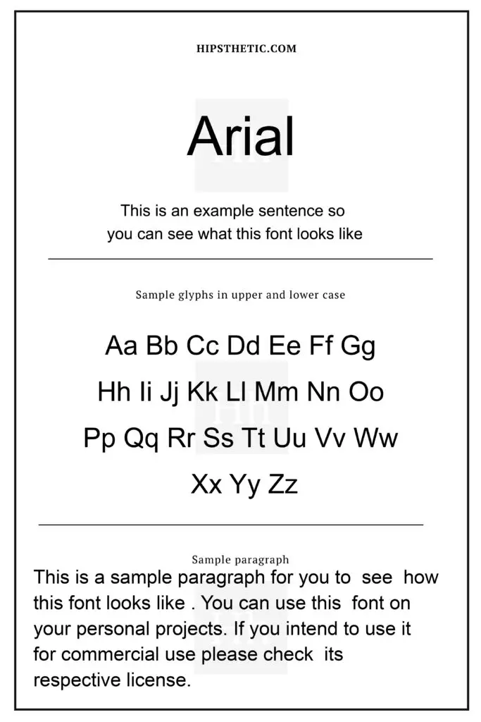
Arial Font
Arial is one of those fonts that will always be a classic. This sans-serif font has a clean, modern look that is easy to read in both print and digital formats. This font is easily accessible in multiple software and is sometimes used as a default font.
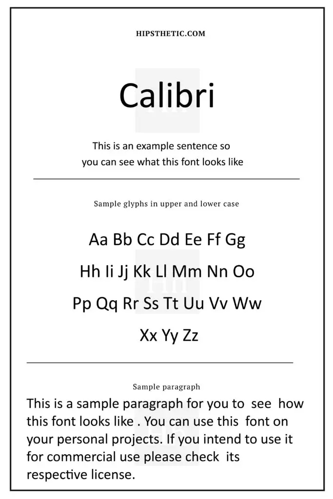
Calibri Font
The Calibri Font is also considered one of the classic sans serif fonts out there. What’s unique about the Calibri font is its slightly rounded design that helps with making the font easier to read than other sans serif fonts.
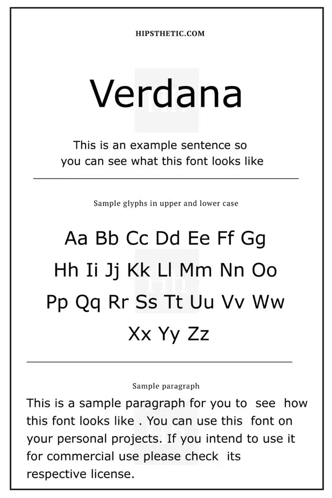
Verdana Font
One of the Verdana’s features that adds to making it easy to read is its wide letterforms and a large x-height. These features surely create a more legible font.
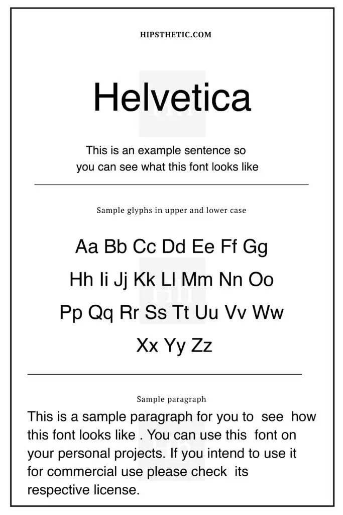
Helvetica Font
This classic sans serif font has a neutral yet pristine appearance and a tall x-height. Its unique makeup immediately makes the typeface easier to read even at distance.
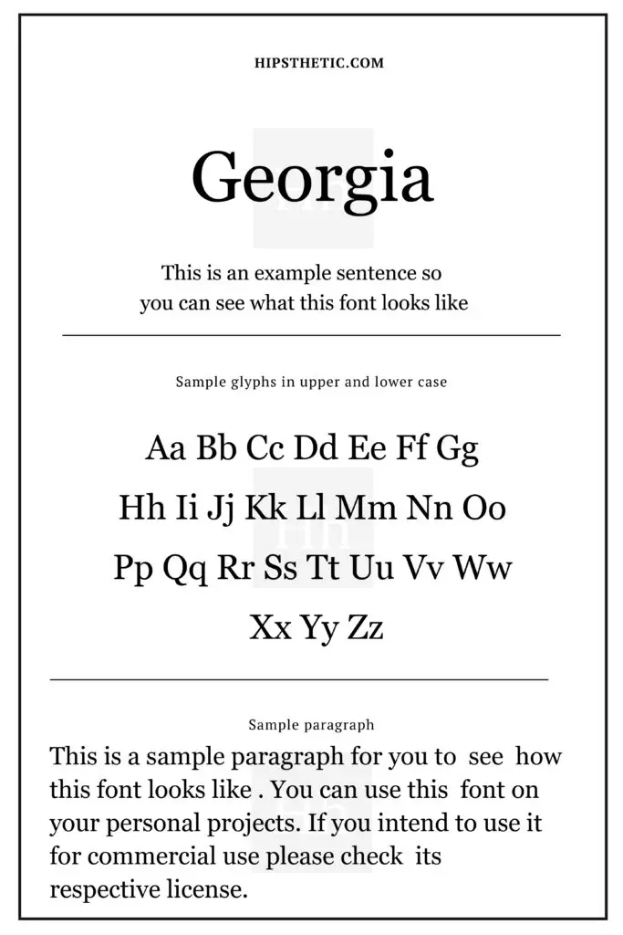
Georgia Font
The Georgia font has a transitional serif design and a large x-height, which makes it easier to read than other fonts.
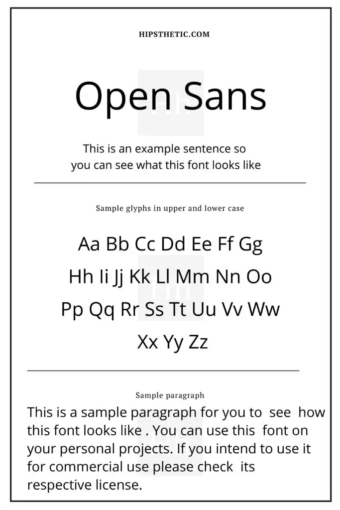
Open Sans Font
The Open Sans, sans serif font, has a large x-height and open letterforms, this combination makes the font one of the fonts that are easiest to read.
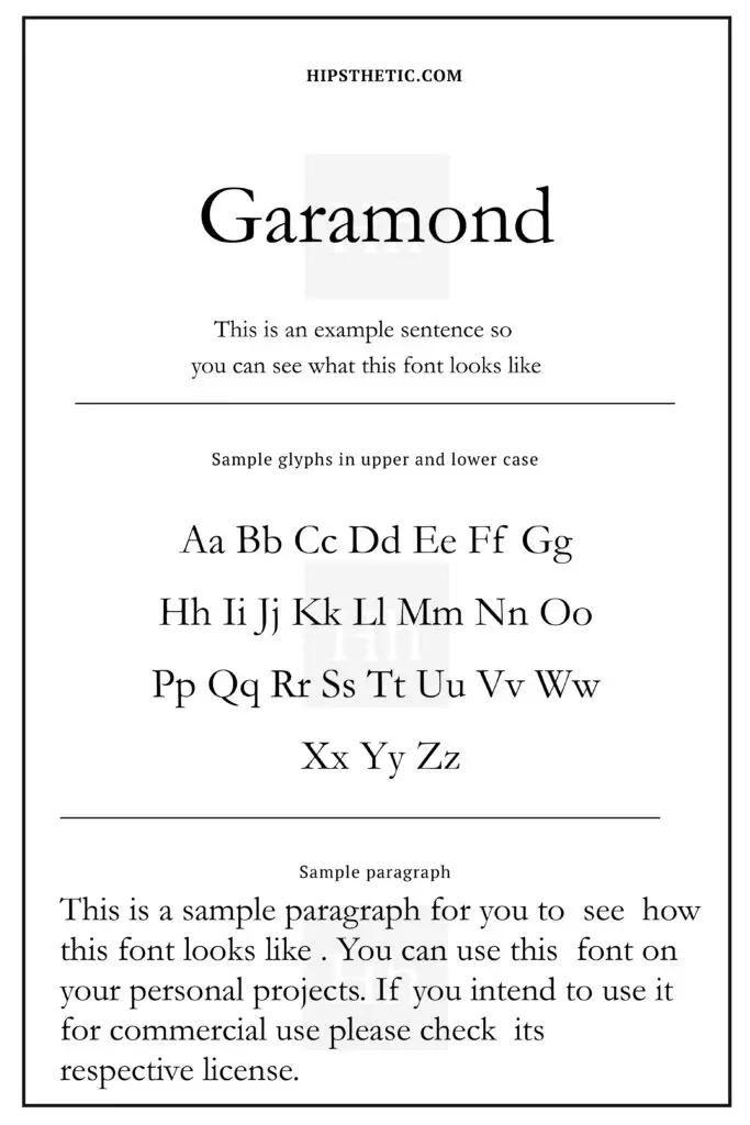
Garamond Font
The Garamond font is definitely one of the classic serif fonts out there that’s widely used for printed materials such as book printing and body text. This font’s open letterforms and wide form makes it one of the fonts that are easiest to read.
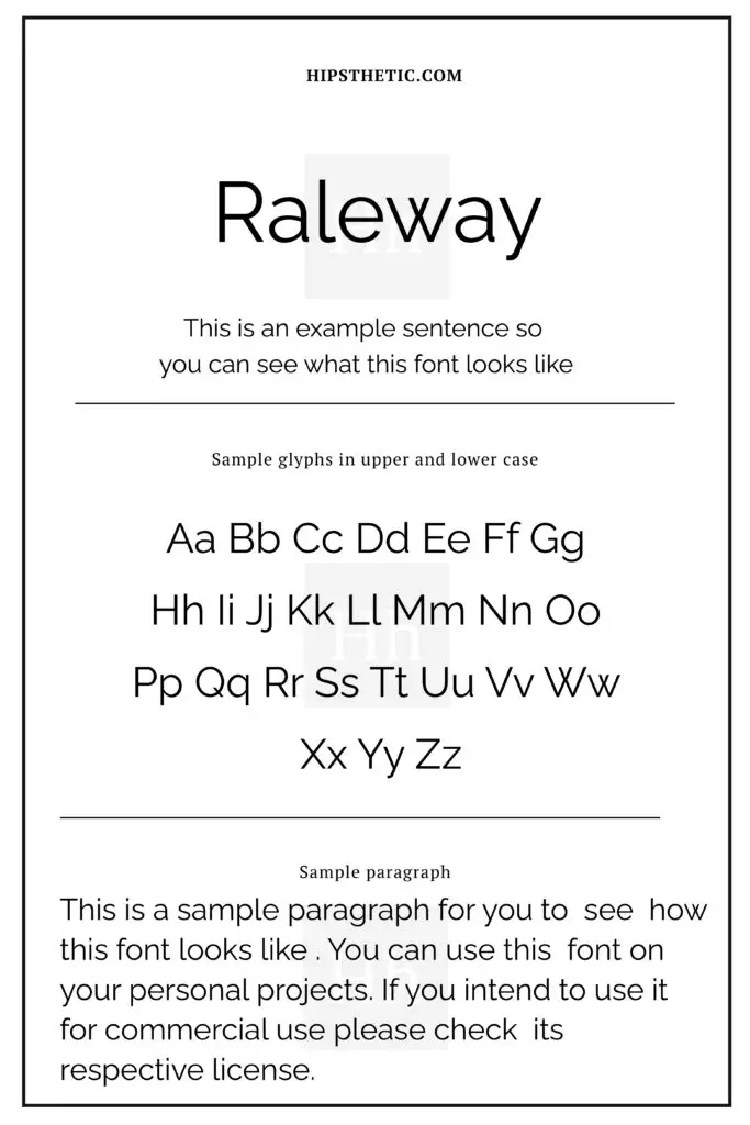
Raleway Font
The Raleway font is a great stylish sans-serif font that features structure and balance. This font is a great choice for headers and titles, and as a copy and body text font as well!
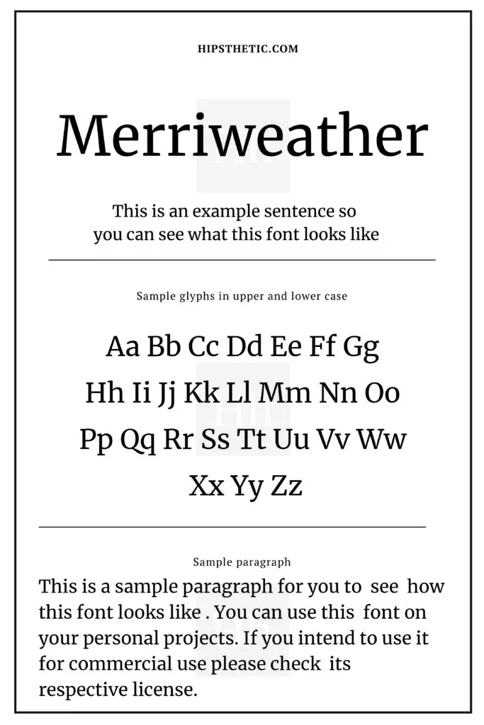
Merriweather Font
The Merriweather font was originally utilized as an easy-to-read font for screens. This font’s huge x-height and tight letterforms make it a font that’s easy on the eyes.
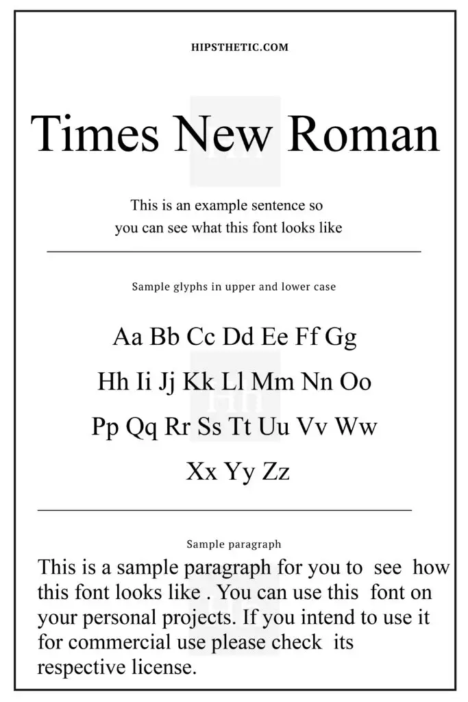
Times New Roman
We can never go wrong with Times New Roman! This classic serif font is easy to read mainly because of its simple design and balanced letterforms.