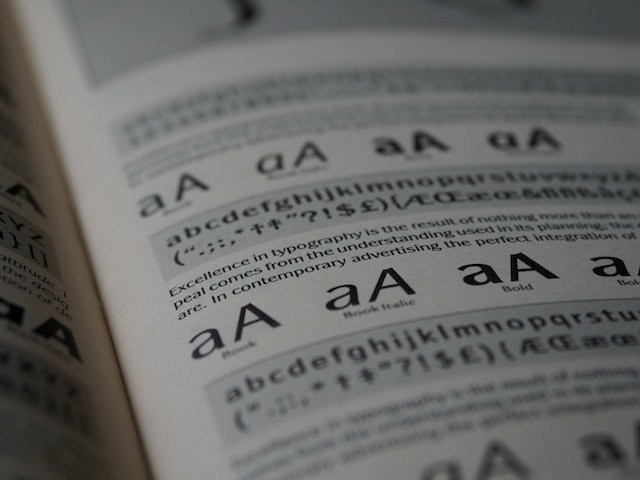
There are tons of different font styles available out there, but ultimately there are two main types of fonts: the serif and the sans serif. We always talk about the font aesthetic and vibe that these font types give, but we have never really delved into their history. So for this post, we’re looking closely into the history and significance of these font types.
What is a Serif Font?

Serif fonts are easily recognized by their tiny lines extending from the letter edges, known serifs. Serif fonts first appeared in print over 500 years ago during the 15th century, first seen in Italy and France, but gained widespread popularity during the 17th century. Serifs were a practical way to add detail to typography and create visual harmony between incremental lines. Readable texts were the goal, and serifs were added as a stylistic flourish to differentiate them from the handwritten texts they were derived from.
Serif Fonts and Printing Press
Serif fonts played a significant role during the time the printing press was invented. The printing press paved the way to mass-produce books and other printed materials, and Gutenberg, the inventor of the printing press, used serif fonts. Eventually, serif fonts became the standard for most printed materials for centuries.
Serif Fonts Aesthetic
Serif fonts have a traditional and classic look, and reflect the era in which classic books and manuscripts were designed. Because the serifs give a clarity and distinct form to the letter, they appear official and help add authority to the content.
What is a Sans Serif Font?
Sans serif fonts are simply put, fonts without serifs. San serif fonts were first developed in the 19th century during the Industrial Revolution. In the 19th century, modernity and technology were growing, and sans-serif fonts expressed this through their sleek lines and more modern look. Sans serif fonts gradually gained popularity for use in the body text as well, and today they are just as common as serif fonts.
Sans Serif Fonts Aesthetic
Since sans serif fonts don’t have ornamental serifs, and instead have mostly straight lines or rounded terminals, this gives the font an overall modern look with a sense of movement, energy, and dynamism. One of the most popular aesthetics that Sans Serif fonts touch is the “minimalist-clean” aesthetic which is widely popular in modern design.
Modern Serif and Sans Serif Fonts
Serif and sans-serif fonts both have a significant history. With centuries of printing and typography experience, these fonts have been perfected to convey various messages. In modern times, both font styles are now more versatile than ever. Serif fonts, typically seen in professional settings, have been used in unexpected and humorous ways to surprise and delight readers. Meanwhile, sans-serif fonts continue to offer modern, sleek lines that work particularly well on digital platforms.
Choosing The Right Fonts for Design
As discussed, Serif and sans-serif fonts both have long histories and continue to grow even in modern times. Both font styles offer a unique function and aesthetic, and with this, you can incorporate these fonts into plethora of designs.
FREE Sans Serif and Serif Fonts
Since you have reached the end of this post, here’s an added treat! Click here to access our list of Free Sans Serif fonts and Free Bold Serif Fonts.
