Fonts are an integral part of any design project, and knowing how to pair them correctly can make a huge difference in the overall look and feel of your work. Font pairing is the art of combining two or more fonts to create a visually pleasing, harmonious design. Check out some tips and tricks of font pairing so that can help you create beautiful, balanced designs!
Understanding Fonts
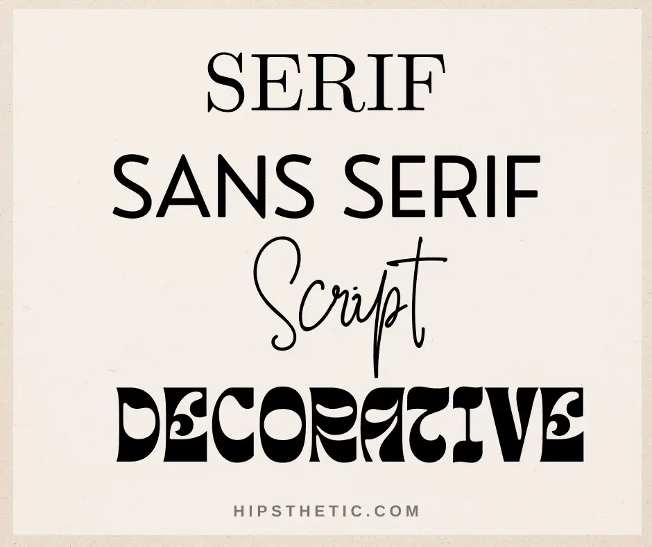
Before you can start pairing fonts, it’s important to understand the basics of typography. Every font has a personality, and understanding the different characteristics of each typeface can help you make the right choices when combining fonts. Generally speaking, there are four main font categories: serif, sans serif, script, and decorative. Serif fonts are characterized by small lines at the ends of their letters, while sans-serif fonts lack these lines. Script fonts are cursive in nature, while decorative fonts are more ornate and often used to add a special touch to a design.
Finding Complementary Fonts
Once you have a basic understanding of fonts, you can start looking for fonts that complement each other. A good rule of thumb is to start with one font as the primary font and then find a secondary font to pair with it. You should also consider the overall tone of your design. Is it serious or playful? Formal or casual? Knowing the tone can help you narrow down your font choices.

Mix & Match
When it comes to font pairing, you don’t have to stick to the same font family. You can mix and match font styles from different families to create interesting and unique designs. For example, you can pair a serif font with a sans serif font, or a script font with a decorative font. Just make sure the fonts you choose are visually compatible.

Contrast & Balance
It’s also important to consider contrast and balance when pairing fonts. Contrast is used to draw attention to certain elements, while balance helps create a sense of harmony. To create contrast, you can use fonts of different sizes or styles. For example, you can pair a bold font with a thin font, or a script font with a sans serif font. To achieve balance, try to pair fonts that are similar in weight and style.

Experiment & Have Fun
The best way to master font pairing is to experiment and have fun with it. Try different combinations of fonts and see what works. Keep in mind the tips and tricks outlined above, and you’ll be able to create beautiful, harmonious designs in no time.

Conclusion
Fonts are an integral part of any design project, and knowing how to pair them correctly can make a huge difference in the overall look and feel of your work. Font pairing is the art of combining two or more fonts to create a visually pleasing, harmonious design. Check out some tips and tricks of font pairing so that can help you create beautiful, balanced designs!
Understanding Fonts
Before you can start pairing fonts, it’s important to understand the basics of typography. Every font has a personality, and understanding the different characteristics of each typeface can help you make the right choices when combining fonts. Generally speaking, there are four main font categories: serif, sans serif, script, and decorative. Serif fonts are characterized by small lines at the ends of their letters, while sans-serif fonts lack these lines. Script fonts are cursive in nature, while decorative fonts are more ornate and often used to add a special touch to a design.
Finding Complementary Fonts
Once you have a basic understanding of fonts, you can start looking for fonts that complement each other. A good rule of thumb is to start with one font as the primary font and then find a secondary font to pair with it. You should also consider the overall tone of your design. Is it serious or playful? Formal or casual? Knowing the tone can help you narrow down your font choices.
Mix & Match
When it comes to font pairing, you don’t have to stick to the same font family. You can mix and match font styles from different families to create interesting and unique designs. For example, you can pair a serif font with a sans serif font, or a script font with a decorative font. Just make sure the fonts you choose are visually compatible.
Contrast & Balance
It’s also important to consider contrast and balance when pairing fonts. Contrast is used to draw attention to certain elements, while balance helps create a sense of harmony. To create contrast, you can use fonts of different sizes or styles. For example, you can pair a bold font with a thin font, or a script font with a sans serif font. To achieve balance, try to pair fonts that are similar in weight and style.
Experiment & Have Fun
The best way to master font pairing is to experiment and have fun with it. Try different combinations of fonts and see what works. Keep in mind the tips and tricks outlined above, and you’ll be able to create beautiful, harmonious designs in no time.
Conclusion
Font pairing is an art, and it takes time to master. However, by understanding the basics of typography, finding complementary fonts, mixing and matching different font styles, and creating contrast and balance, you can create stunning designs with ease. So, what are you waiting for? Get out there and start experimenting! If you enjoyed reading this, check out our posts on Holiday Font Pairing, and Font Pairing for Logos.