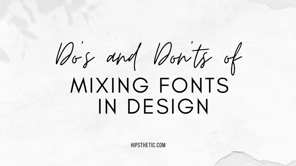
Fonts are one of the most important elements of design. They can set the tone for a piece of work, create a sense of hierarchy, and even help to convey a message. But when it comes to mixing fonts, there are a few things to keep in mind.
In this post, we will discuss the dos and don’ts of mixing fonts in design. We will cover topics such as choosing the right fonts, creating contrast, and avoiding common mistakes. By following these tips, you can create designs that are both visually appealing and effective.
Dos of Mixing Fonts in Design
Choose fonts that complement each other
When mixing fonts, it is important to choose fonts that complement each other. This means choosing fonts that have similar styles or characteristics. For example, you might choose a classic serif font for the body text and a more modern sans-serif font for the headings.
Create contrast
Another important tip is to create contrast between the fonts you choose. This will help to make your design more visually appealing and easier to read. You can create contrast by choosing fonts that are different in size, weight, or style.
Use fonts to create a hierarchy
Fonts can also be used to create hierarchy in your design. This means using different fonts to indicate different levels of importance. For example, you might use a larger, bolder font for the title of your design and a smaller, lighter font for the body text.
Avoid using too many fonts
It is important to avoid using too many fonts in your design. Too many fonts can be overwhelming and make your design look cluttered. Stick to using two or three fonts at most.
Don’ts of Mixing Fonts in Design
Don’t use similar fonts
As mentioned above, it is important to choose fonts that complement each other. This means avoiding using fonts that are too similar. For example, you wouldn’t want to use two different serif fonts in the same design.
Don’t use fonts that are too different
On the other hand, you also don’t want to use fonts that are too different. This can create a jarring effect and make your design look unbalanced.
Don’t use all caps
Using all caps can make your text difficult to read. It is best to use all caps sparingly, if at all.
Don’t use too many different font sizes
Just like using too many fonts, using too many different font sizes can make your design look cluttered. Stick to using a few different font sizes to create a sense of hierarchy.
More Tips for Mixing Fonts for Design
Use a font pairing tool
There are a number of online tools that can help you pair fonts together. These tools can be a great way to get started with mixing fonts and to find new combinations that you might not have thought of on your own.
Look at the overall mood of your design
The fonts you choose should reflect the overall mood of your design. For example, if you are designing a website for a children’s book, you might want to choose playful fonts. If you are designing a website for a law firm, you might want to choose more serious fonts.
Experiment
The best way to learn how to mix fonts is to experiment. Try different combinations and see what works best for you. There are no right or wrong answers when it comes to mixing fonts. The most important thing is to create a design that you are happy with.
Mixing Fonts
By following these tips, you can create designs that are both visually appealing and effective. When mixing fonts, it is important to choose fonts that complement each other, create contrast, and avoid common mistakes. By doing so, you can create designs that are sure to impress.