As many of you know, designing a logo is no easy feat. It requires a delicate balance of being aesthetically pleasing while effectively representing a brand. When done correctly, a logo will establish a brand’s personality with a memorable image. We have seen some cringe-worthy logos that have made some of us at the studio scratching our heads, while others are clever and well designed.
Some designers take designing a logo to a whole new level by taking advantage of negative space. Logos that use negative space allow the consumer to look at the image more carefully, contributing to the main goal: to make the logo memorable. Some of the best logos we have seen use negative space to create an illusion. Using negative space for a logo can incorporate two or three images that will pinpoint exactly what the brand or company does.
Using negative space to illustrate another image is not an easy task. It requires designing one unique image that can create negative space for a second image to also coexist. Both of the images have to be noticeable and related to service or product of the brand. The main goal of a logo is to leave the consumer wanting to more, and these logos accomplish just that.
1. Movers Logo
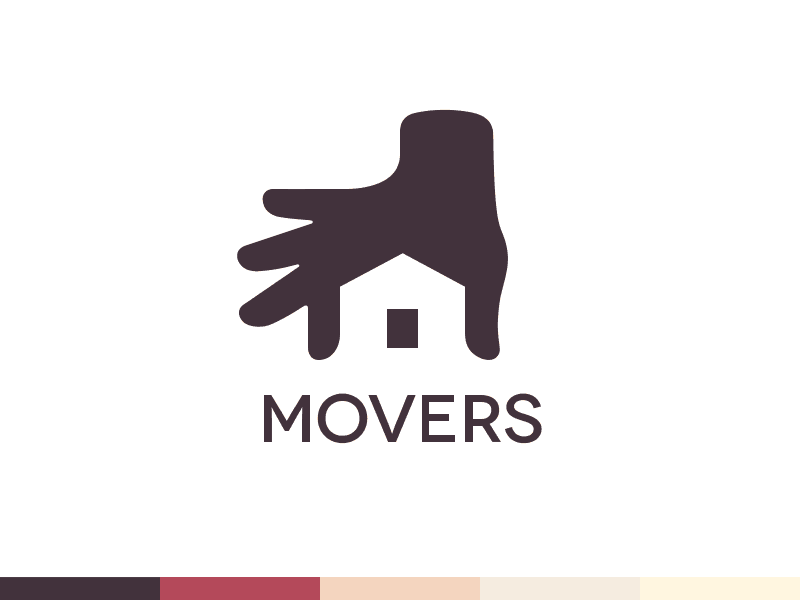
This logo for a moving company does a great job of using negative space to establish what this company does: help you move. Designed by Ramotion, this is an excellent example of using two images related to your company to symbolize your company.
2. Neg Dog Cat
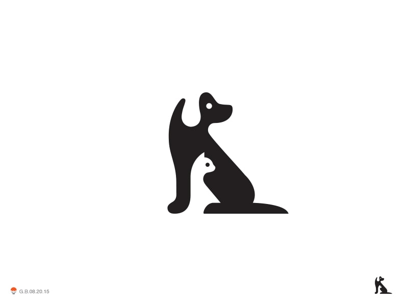
This logo was designed for a fictional company by George Bokhua. The clever design of the dog helps create negative space for a cat. We think this logo would be perfect for an animal hospital.
3. VinoPiano
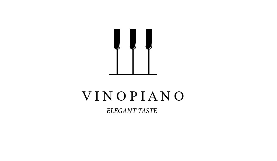
VinoPiano is a wine and tapas piano bar in Hungary. This logo use wine glasses to also illustrate piano keys. This brilliant design was done by Mootto Studio.
4. Safari Into Africa Logo
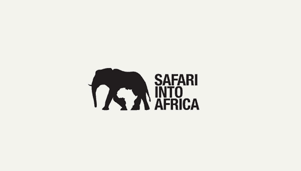
Safari Into Africa offers, well, safaris into Africa. The Elephant creates negative space in between its legs to illustrate the country of Africa. This well-done logo was designed by Glad Creative.
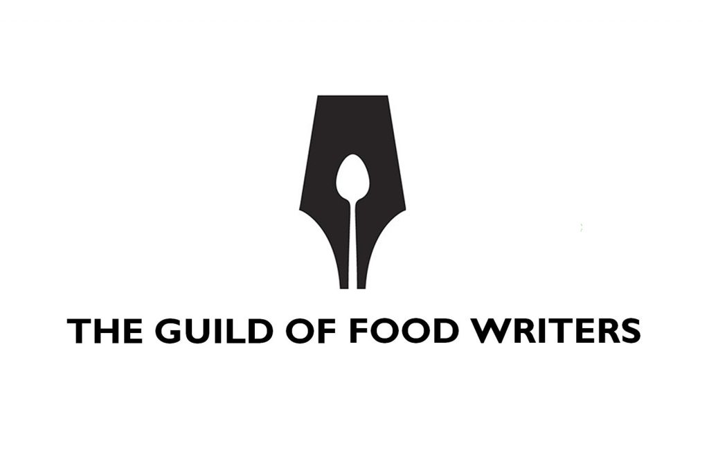
5. Guild of Food Writers
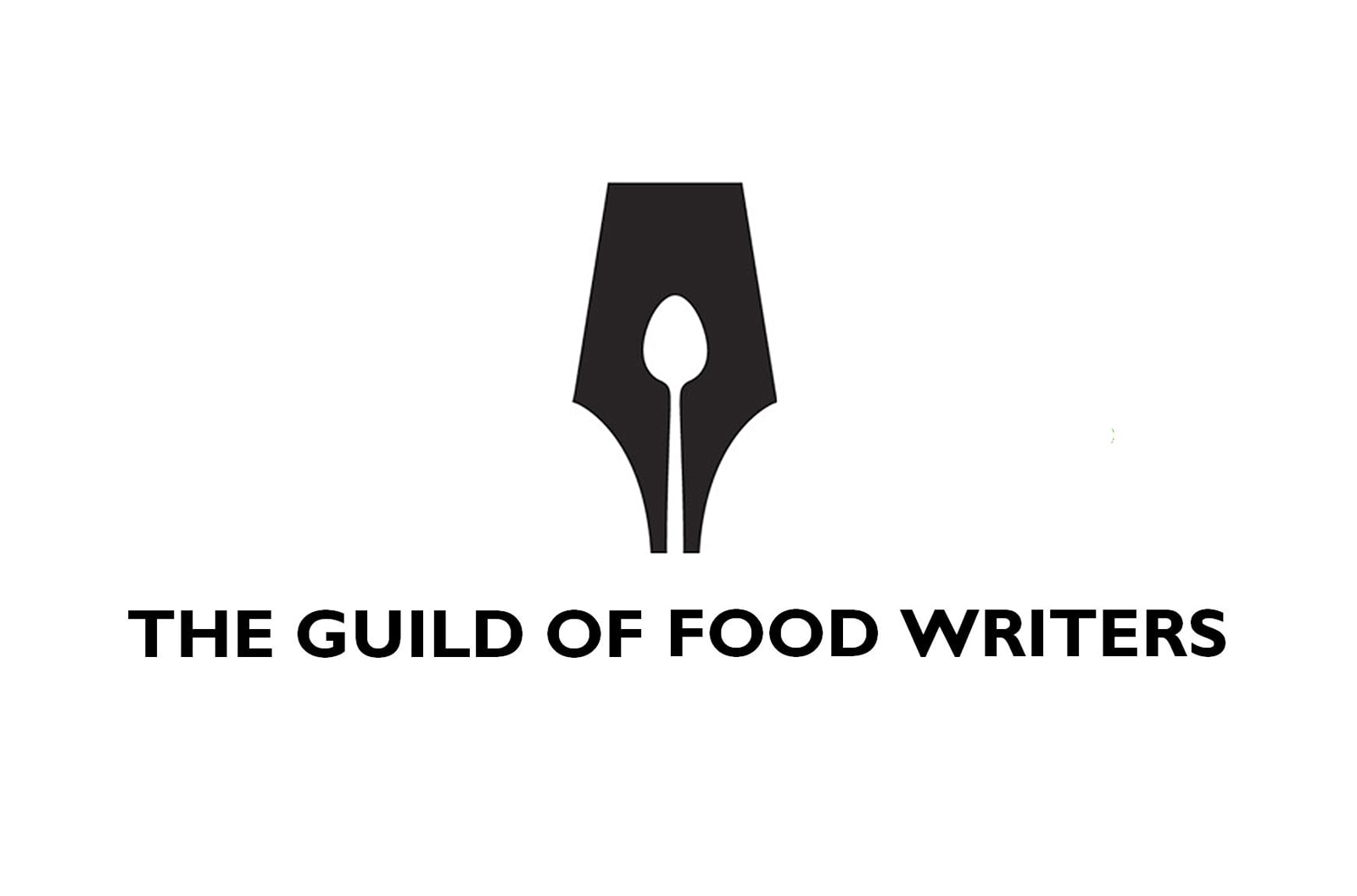
This classic logo is for the Guild of Food Writers, an association of food broadcasters and writers in the UK. The spoon inside created by negative space is very tasteful (sorry, we couldn’t resist). This was designed by 300million, an agency that appears to have gone out of business.
6. 8 Fish
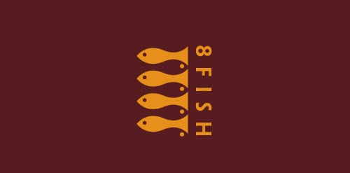
This logo is for a sushi restaurant. Designed by Jerron Ames, we love that the fish help creates negative space for other fish.
7. Circus of Magazines Logo
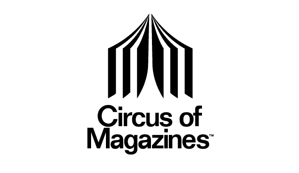
This brilliant logo won the 2009 WOLDA (World Logo Design Annual) in the “Best of USA”, “Best of Americas” and “Best of the World” categories. It was designed by Oliver Courbet for the online marketplace Circus of Magazines.
8. Paint the City
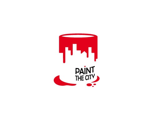
The negative space in this logo creates a city inside a paint bucket. We found this clever logo on Logopond. Consumers will appreciate a logo that uses color to create negative space.